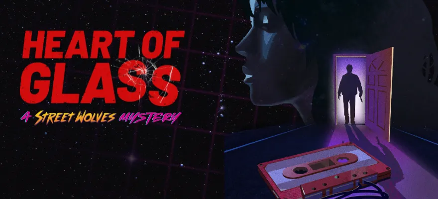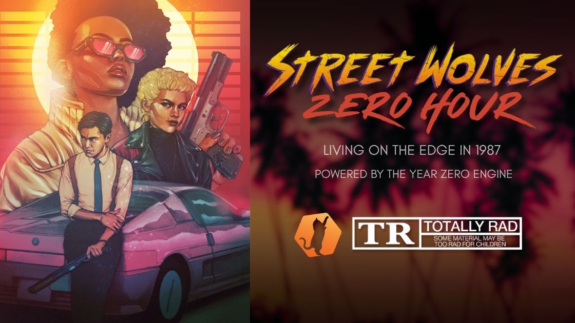
The last Street Wolves: Zero Hour dev post post I mused a bit about theory of the design, this time let's look at something pretty, the Street Wolves: Zero Hour cover art! Or rather, the process of commissioning the cover art.
If you're a burgeoning tabletop game creator and want to know what it's like to work with an artist, this is the post for you.
Side Note: I don't support using AI for art at all. It's completely unethical. But also, art should be created by humans. Prompting a machine is not creating art.
What I Wanted Going in
One of the most important parts of this whole process was knowing what I wanted out of the new cover art
- It must look different than the Turbo Edition cover art to really set them apart, but also look like it comes from the same "genre."
- Following that, It should be brighter and more colorful.
- It should have the characters Scorpion and Turbo who are on most of the other covers of Street Wolves products, but there should be at least one more character. (I figured I could have one of my favorite Wolves, Material Kid.)
- It should look friggen awesome.
And that's about it.
"Hold Up: You Have Money for Custom Art?"
All right, this is a big can of worms. There's a lot of creators out there that don't have two pennies to rub together to pay for a cover. I get it!
I'm in a position where I can pay for cover art depending on the project. For Zero Hour I have a lot of confidence in it being at least as successful as Shadow in the Stars or Monster Truckers. And if it is, I am willing to pay up front for good cover art.
Now, if I was working on a very low cost adventure, then I'd be really reluctant to spend much or anything. If you take a look at the "Ultimate Red Rumble" Street Wolves adventure, I made that cover using photoshop and a stock photo.
Picking the Artist
I know a lot of talented artists and there are even more that I don't know. For this project I knew I wanted something good and I also didn't want to take a chance on someone new. Usually when I work with an artist I commission a small piece first to see how we work together. I didn't want to commit to someone I didn't know with an important cover.
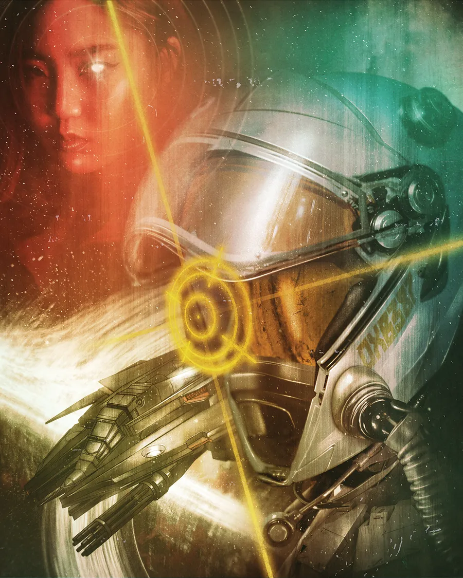
Out of the artists I've worked with I gravitated towards Scrag End (that's the name he goes by) for this particular project. I enjoyed working with him on the Shadow in the Stars cover. That one was more of a photo bash. It took existing assets and turned them into art (aside from the Starfighter which was designed/illustrated by Gunmetal Draws.
I knew Scragend could do a more illustrated style based on other work that he posted. He has done a lot of cyberpunk related things and even though Street Wolves is not cyberpunk, it leans into the same areas enough that I was confident he could do what I was looking for in a cover.
I wrote Scrag End an email, asking him if he would be interested in working on Zero Hour. I gave a few details on what it was and the kind of style I was looking for. I also sent some images of synthwave art in case he wasn't familiar with it already.
He followed up that he was interested and it was off to the races!
Coming up with Examples and Inspiration
I spend a good chunk of time hitting the interwebs looking for inspirational images of what kind of cover I wanted (and working as hard as I could to avoid AI images).
I pulled in movie posters, other rpg titles, pictures of characters, video game posters and that sort of thing until I felt like I had a good enough feel of the cover "vibes."
This part could have come up earlier and probably should have, but I was more concerned with securing an artist first on this one.
Deciding on a Composition
Sometimes I have a vision in my head of what I'd like to see. For instance, with Shadow in the Stars I wanted a close up of the pilot, the ship, and some other stuff like planets and junk. For Zero Hour, I was really stuck. I didn't know what I wanted.
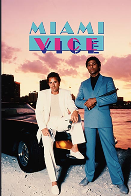
The big problem that I really wanted to avoid was people in front of a car.
Miami Vice did It:
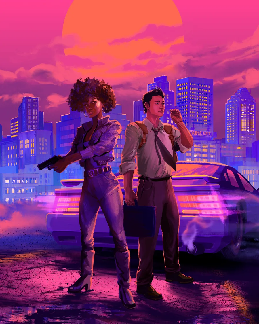
And I did it with Street Wolves: Turbo Edition:
And this rpg does it:
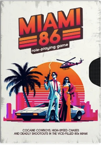
I really wanted to avoid looking like so many iterations of this motif. When I did my research and worked on the art brief, I had a few ideas that were a bit different than the standard people in front of a car thing.
Side Note: You might be thinking wait, isn't Miami 86 what Street Wolves is? Aren't you making the same game? No, because first the original version of Street Wolves came out first, so I'm working on a version of my world that came out before this other game. But more importantly, there's tons and tons of lore, tonality differences, and mechanics that make them different games.
The Art Brief
When I made the first Street Wolves and began looking for art I put together a detailed document of what Street Wolves was and the aesthetics I was trying to capture. Basically, a guide for the art.
When it came time to do Shadow in the Stars, Scrag End asked for an "art brief" which, uh, was the first time I heard it called that because I'm a noob. I had basically invented something that already existed.
But anyway, the art brief could be its own post, but here's basically what is in mind:
- Explaining briefly what Street Wolves is.
- What is the deliverable, basically what the artist is going to make.
- Some composition ideas.
- The style of art I'm looking for.
- The color palette we should stick to.
- Technical stuff like the size and resolution of the image that we're making.
- Links to references (car, characters)
- What we should avoid. Basically, any important notes of things to stay away from.
This gave Scrag End a good idea of what I was looking for and he didn't have to start from a blank canvas or guess what I wanted.
He really only had one question at the start, whether I wanted a "flatter" style or a more detailed style. I elected to go more detailed since it's the cover. I was willing to pay a bit more for more detail. If this was interior art, I'd have gone flatter.
The Contract
With a yes from the artist and a few details worked out with him, it was time to sign a contact!
Okay, contract is a bit of a loaded term. I refer to them as agreements. I'm not sure if they're legally enforceable, but I like having them so we can spell out the project in more exact terms so we don't have to rely on memory or an email chain where things can get muddled.
I have an agreement that I've cobbled together from ones I've gotten from artists and other creators. Here's some highlights of what is in it:
- Outline exactly what the work is for and what the deadlines are (even if they're a little vague). This is helpful to establish that even if you're a bit more fluid on a delivery date, it sets an expectation of the latest you can get the art.
- What the payment is and what details surround it, like how I'll pay the artist, if there's installments, what payment processor we'll use, etc.
- Make it clear that the artist is an independent contractor and not an employee and there's no other partnership beyond this work.
- Outline how many revision stages there will be and at least trying to define what is an unreasonable amount of changes.
- Who owns the rights to the work. Sometimes you can fully own art from the artist and other times you'll have to pay extra for being able to use it on merchandise. And lots of times you'll want to make it clear if the artist is able to sell prints of their work (I'm always down for this).
- Outline how the artwork will be used. For instance, I like to state what publication it'll be used for in addition to making it clear that it'll be used in promo materials and if it'll be used in merchandise.
- A section that talks about how the work can be removed. For example, if the artist plagiarized the work it can be taken down and the contact can be voided. On the artist's end, whether or not there are circumstances for them to request their work to be pulled.
- Who pays legal fees if something goes horribly wrong. An example of this is if the artist plagiarized the work and they're sued. The agreement states that the publisher has no responsibility and that the artist has to pay all legal fees.
- Finally, how and when rights are transferred from artist to publisher.
The Prototype Stage
After Scrag End signed the agreement, we moved into the prototype stage.
He asked me for more details about the characters that were going to go on the cover. Not about their style or looks, but more about their personalities. I appreciate that level of thinking about a project.
Now the fun really begins! Here's the early concept art:
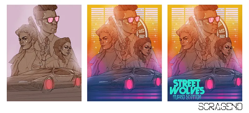
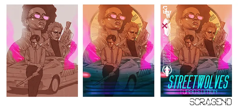
It's important to note that the art was in "color" in more or less a vibe check kind of way. They weren't at all a proposed final. It was just a nicer way to do it than straight up black and white.
Anyway, remember how I didn't want to have people in front of a car? After looking at Scrag End's mockups here I was really drawn to Scorpion standing in front of the car rather than the other version. They're both great, but there was something about it that spoke to me.
I focused on that one when I responded with feedback, which I'll list here so you can see where my mind during this process.
These are the gist of the notes I sent to Scrag End:
- Material Kid's attitude should be more snarky or sassy, less angry. And her likeness felt off.
- Change the pistol to be a Bren 10 (as an Easter Egg for fans of a certain show).
- Increase the size of the car, Scorpion appeared too large in comparison.
- Remove the side pipes from the car.
- Tone down the plasticy look on the characters.
- Remove the halo design around Scorpion.
- Instead of an analog clock in the background, perhaps there could be more of a digital gauge or replace it with a synthwave sun.
After he got back to me and we discussed the changes a bit he asked me if there was any kind of symbol that could go on the gun. I decided it might be fun to put the Wolfpack logo on it.
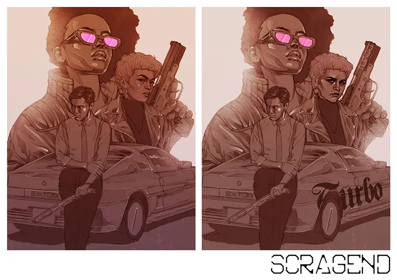
This is what he sent in with the changes. As you can see there's a few other things here and there that he tried, like two expressions and the writing on Turbo's car.
Side Note: As cool as I thought the writing on the gun was, I just couldn't bring myself to authorize something that could land Turbo in jail if she had to use it on someone, I've seen too much The Wire. The Wolves should be disposing of their guns and not branding them.
I gave some feedback, he went back to work, and then came back with the final mockup:
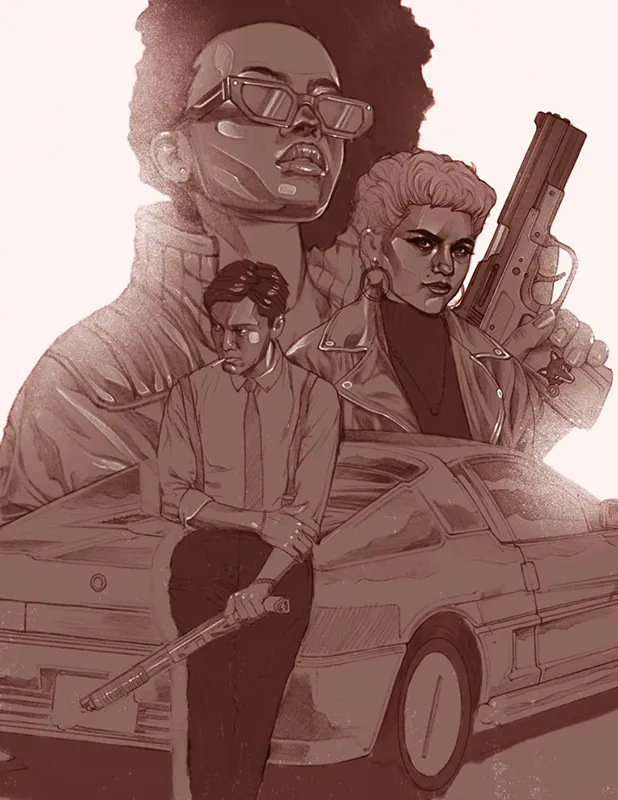
We've pretty much finalized everything here, especially the sizing of Scorpion and the car. With this part done, he moved on to finishing the piece up and coloring it.
Wrapping Up
That's the journey of making the Street Wolves: Zero Hour cover art. I hope you were able to get something useful out of it. And I hope you agree with the direction I steered it.
A big thank you goes out to Scrag End for working with me on this and for allowing me to share the concept phases!
Before you leave, please consider folowing Street Wolves: Zero Hour on Backerkit if you haven't yet, so you don't miss when it launches.
If you have already followed it, you're awesome.
Follow on Backerkit